
Quick Answer: A professional logo needs to communicate what a business does, signal its personality, and remain recognisable at any size, from a website favicon to a vehicle wrap. A logo is a single mark. A logo system is a family of variants (primary, stacked, icon-only, reversed) designed to work across every context. A complete brand identity adds typography, colour palettes, and usage guidelines so every customer touchpoint looks intentional and consistent. Most small businesses need at least a logo system; many benefit from a starter brand identity.
Key Takeaways
- A professionally designed logo builds immediate trust and visual recognition that generic templates rarely achieve.
- Logo design for small business is not just one file, a complete package includes multiple variants, colour versions, and both vector and raster formats.
- Writing a clear one-page brief before hiring a designer dramatically improves results and reduces revision rounds.
- Cost varies widely based on scope, experience level, and deliverables, understanding what drives price helps small-business owners budget accurately.
- Knowing when to refresh, redesign, or start from scratch saves time and money at critical growth stages.
Table of Contents
- What a Logo Does for a Small Business
- Logo Design vs Brand Identity: What Is the Difference?
- The Main Types of Logo Designs
- Popular Logo Styles and When They Work
- Logo Design for Different Small-Business Types
- The Core Elements of an Effective Logo
- What a Complete Logo Package Should Include
- How to Write a Logo Design Brief
- The Professional Logo Design Process
- How Much Does Logo Design Cost?
- How to Choose the Right Logo Design Specialist
- DIY Logo Tools vs Hiring a Professional
- Common Logo Design Mistakes to Avoid
- Logo Refresh, Redesign or New Logo?
- How Logo Design Connects to Your Website and Marketing
- Logo Design FAQ
- References
What a Logo Does for a Small Business
A business has roughly seven seconds to make a first impression on a new customer. The logo is often the first thing that person sees, on a sign, a social profile, a business card, or a search result. For small businesses competing against larger, better-resourced brands, that first impression carries enormous weight.
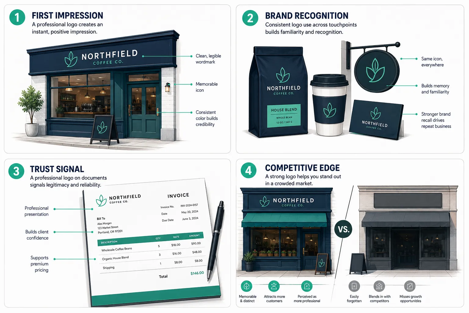
Logo design for small business is not a vanity exercise. A well-constructed logo does several practical jobs simultaneously:
- Signals professionalism. A polished mark tells customers the business takes itself seriously, which makes them more likely to trust it with their money.
- Creates recognition. Repetition builds familiarity. When the same mark appears on a storefront, an invoice, a social media profile, and a delivery vehicle, customers begin to associate it with reliability.
- Differentiates from competitors. In a crowded local market, a distinctive logo is one of the few visual assets a small business fully owns.
- Supports marketing consistency. Every piece of marketing material, digital or print, anchors to the logo. Without a strong mark, brand consistency is nearly impossible to maintain.
A logo does not need to explain the entire business. Its job is recognition and association. Over time, customers attach meaning to the mark based on their experiences with the brand.
Logo Design vs Brand Identity: What Is the Difference?
These two terms are often used interchangeably, but they describe different scopes of work.
| Term | What It Includes |
|---|---|
| Logo | A single primary mark (wordmark, icon, or combination) |
| Logo System | Primary logo plus variants: horizontal, stacked, icon-only, reversed |
| Brand Identity | Logo system plus colour palette, typography, iconography, and usage guidelines |
| Full Brand Package | Brand identity plus templates: business cards, letterhead, social assets, signage |
Most small businesses launching for the first time need at minimum a logo system. A single logo file is rarely enough, different contexts require different shapes and orientations. A complete brand identity is the next step and pays dividends quickly once marketing activity scales.
For a deeper look at how brand identity works for small businesses, the brand identity for small business guide covers the full picture, including how to fix inconsistent branding that has already crept in.
The Main Types of Logo Designs
Understanding the vocabulary of logo types helps small-business owners make informed decisions when briefing a designer or reviewing concepts.
Wordmarks and Lettermarks
A wordmark is the business name set in a distinctive typeface, often with custom lettering adjustments. Think of it as the name itself becoming the brand mark. Wordmarks are praised for their low implementation complexity, timeless feel, legibility, and ease of reproduction, and they tend to be more straightforward to trademark because they are name-specific.
A lettermark uses initials rather than the full name. This works well when the business name is long or when the abbreviation is already well-known.
Best for: Service businesses, professional practices, consultancies, and any business where the founder’s name is the brand.
Symbols, Icons and Abstract Marks
A symbol or icon is a pictorial mark that represents the business visually. It can be literal (a house icon for a real estate firm) or abstract (a geometric shape that conveys movement or growth). Well-designed icons can provide instant visual recognition and clear industry signalling.
Abstract marks use shapes and forms that carry no inherent meaning, they build associations over time through repetition.
Best for: Businesses planning to expand internationally, product companies, and brands that want a strong standalone icon for app icons or social avatars.
Combination Marks and Emblems
A combination mark pairs an icon with a wordmark. This is the most versatile format for small businesses because the elements can be used together or separately depending on context.
An emblem integrates the text inside the icon, think badges, seals, and crests. Emblems feel authoritative and established but can be harder to reproduce at very small sizes.
Best for: Combination marks suit most small businesses. Emblems work well for breweries, schools, law firms, and heritage brands.
Mascot, Hand-Drawn, Signature and 3D Logos
Mascot logos use a character, human, animal, or illustrated figure, as the brand representative. They create strong emotional connection and work particularly well for family-oriented businesses.
Hand-drawn and signature logos convey authenticity and personality. They are popular with artisan food producers, independent boutiques, and personal brands.
3D logos add depth and dimension, often used in tech, gaming, and product packaging contexts.
Popular Logo Styles and When They Work
Logo type describes the structure. Logo style describes the visual aesthetic. Both decisions matter.
Minimalist and Modern
Clean lines, generous white space, and restrained colour palettes. Minimalist logos are among the most practical styles for small brands because they scale well, reproduce clearly in one colour, and feel current without chasing trends. They age gracefully.
When it works: Professional services, tech startups, health and wellness, premium retail.
Vintage and Retro
Distressed textures, muted palettes, serif typefaces, and badge-style layouts evoke heritage and craft. Vintage logos signal authenticity and history, even for new businesses, when used with intention.
When it works: Craft breweries, barbershops, coffee roasters, artisan food brands, independent bookshops.
Luxury and Premium
Thin serifs, gold or monochrome palettes, generous spacing, and restrained detail. Luxury logos communicate exclusivity through what they leave out rather than what they include.
When it works: High-end hospitality, jewellery, bespoke services, premium skincare.
Playful, Friendly and Hand-Drawn
Rounded letterforms, bright colours, illustrated elements, and informal compositions. These logos lower the emotional barrier for new customers and signal approachability.
When it works: Children’s services, food and beverage, pet businesses, community-focused brands.
Industry-Specific Styles
Some industries have visual conventions that customers expect. A law firm that uses a playful cartoon logo risks undermining trust. A children’s activity centre that uses a severe minimalist mark may feel cold. Understanding category conventions, and deciding deliberately whether to follow or subvert them, is part of good logo strategy.
Logo Design for Different Small-Business Types
Logo design for small business varies significantly by industry and business model. Here is how the priorities shift.
Startups and New Businesses
Speed and flexibility matter most. A startup logo needs to work across digital channels immediately, website, social profiles, pitch decks, and email signatures. It also needs to be versatile enough to evolve as the business finds its footing. A combination mark with a clean icon and wordmark gives the most options.
Local Shops, Restaurants and Cafes
Physical presence is central. The logo must work on signage, menus, packaging, and uniforms as well as online. Legibility at large and small sizes is critical. Colour choices affect printing costs, so limiting the palette to two or three colours is practical.
Trades and Professional Services
Trust and credibility are the primary signals. Plumbers, electricians, accountants, and solicitors benefit from logos that look established and competent rather than trendy. Vehicle livery and workwear are common applications, so the logo must reproduce cleanly on embroidery and vinyl.
Ecommerce, Coaches and Creators
Digital-first businesses need logos that look sharp at small sizes, social media profile pictures, website favicons, and email headers. A strong icon or monogram that works as a standalone mark is especially valuable. Personal brands often benefit from a signature-style wordmark that centres the founder’s name.
The Core Elements of an Effective Logo
Shape and Symbolism
Every shape carries psychological associations. Circles suggest community and continuity. Squares and rectangles convey stability and reliability. Triangles imply direction, growth, or dynamism. These associations are not rigid rules, but a skilled designer uses them intentionally to reinforce the brand message.
Typography
Typeface selection communicates personality before a single word is read. Serif fonts feel established and authoritative. Sans-serif fonts feel clean and modern. Script fonts feel personal and creative. The typeface in a logo should complement the brand’s personality and remain legible at small sizes.
Colour and Contrast
Colour is one of the most powerful tools in logo design. Different colours carry cultural and psychological associations, blue signals trust, green signals nature or health, red signals energy or urgency. For small businesses, a palette of one to three colours is practical: it keeps printing costs manageable and ensures the logo works across diverse backgrounds.
Contrast is equally important. A logo that disappears against a light background in one context and a dark background in another is a problem waiting to happen.
Simplicity, Recognition and Scalability
The most enduring logos are simple enough to be drawn from memory. Complexity is the enemy of recognition. A logo that looks impressive at full size but becomes illegible on a business card or a phone screen has failed a fundamental test.
Scalability means the logo works from a 16×16 pixel favicon to a 3-metre billboard without losing integrity. This is one of the core arguments for vector file formats, a topic covered in depth in the logo design file formats guide, which explains the practical differences between SVG, EPS, PNG, and JPEG.
What a Complete Logo Package Should Include
Many small businesses receive a single PNG file and consider the job done. That is a significant under-delivery. A professional logo package should include the following.
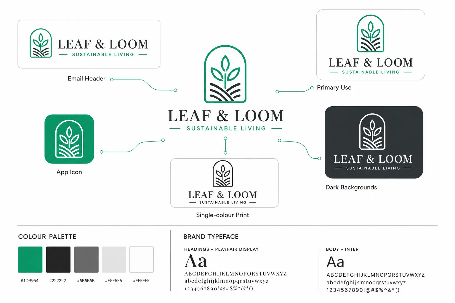
Primary, Horizontal, Stacked and Icon Variants
- Primary logo: The main version, typically a combination of icon and wordmark.
- Horizontal variant: Icon and wordmark side by side, useful for website headers and email signatures.
- Stacked variant: Icon above wordmark, useful for square applications like social profile pictures and print materials.
- Icon-only mark: The standalone symbol, used when the wordmark is not needed or does not fit.
A structured logo design process should produce a full logo system with primary, stacked, and icon-only variants in both colour and black-and-white.
Colour, Black, White and Dark-Background Versions
Every variant should be delivered in:
- Full colour (on white or light backgrounds)
- Reversed/white version (for dark backgrounds)
- Black version (for single-colour print applications)
- Greyscale version (for photocopying and fax applications)
Vector and Raster Deliverables
Vector files (SVG, EPS, PDF) are resolution-independent and essential for print, signage, and future scaling. Raster files (PNG with transparent background, JPEG) are needed for web and digital use. Recent guides identify SVG and EPS as essential for high-quality printing and future scaling.
For a detailed explanation of each format and when to use it, see the complete guide to logo design file formats.
Social, Website, Print and Stationery Assets
A complete package often extends to:
- Social media profile images (correctly sized for major platforms)
- Favicon file
- Business card design
- Letterhead template
- Email signature graphic
Brand kits from professional designers typically bundle logo variations, colour palettes, typography choices, and social media assets, making it easier for small teams to maintain consistent branding.
How to Write a Logo Design Brief
A clear brief is the single most important thing a small-business owner can do before commissioning a logo. It reduces misunderstandings, speeds up the process, and produces better results.
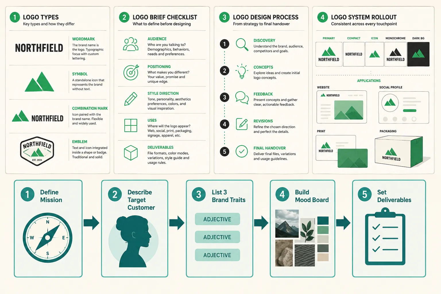
A structured approach recommends writing a one-page brand brief that covers mission, target customer, three personality traits, and a competitor list. Here is a practical checklist:
Logo Design Brief Checklist
- Business name (including any tagline to incorporate)
- Industry and what the business does in one sentence
- Target customer: age range, values, lifestyle, buying behaviour
- Three to five adjectives that describe the brand personality
- Three to five adjectives that the brand should NOT feel like
- Competitors: list three to five, note what you like and dislike about their logos
- Colour preferences or restrictions (including any existing brand colours to match)
- Styles to explore and styles to avoid
- Applications: where will the logo be used? (web, print, signage, embroidery, vehicle wrap)
- Deliverables expected: file formats, variants, brand kit
- Timeline and number of revision rounds
- Budget range
Gathering visual inspiration into a mood board before briefing a designer is also strongly recommended. Screenshots from competitor websites, images from design galleries, and examples of logos the business owner admires all help a designer understand the visual direction without lengthy written descriptions.
For broader guidance on working with creative professionals, the outsource graphic design workflow guide covers the full process of briefing, reviewing, and managing external design work.
The Professional Logo Design Process
Discovery and Research
A professional designer begins by understanding the business, its market, and its customers. This phase involves reviewing the brief, asking clarifying questions, researching competitors, and identifying visual conventions in the industry. The goal is to arrive at a clear strategic direction before any design work begins.
Concepts and Direction
The designer produces initial concepts, typically two to four distinct directions, that interpret the brief in different ways. These are presented as rough sketches or digital drafts, not polished finals. The business owner reviews them and identifies which direction (or combination of elements) resonates.
Testing a few strong logo options with real customers by asking “what does this business do?” rather than “do you like it?” is a recommended approach at this stage. The question shifts feedback from personal taste to functional effectiveness.
Refinement and Revisions
The chosen direction is developed in detail. Typography is refined, colours are tested, spacing is adjusted, and the mark is checked across different sizes and backgrounds. Revision rounds allow the business owner to request changes within the agreed scope.
Final Artwork and Handover
The designer delivers the complete file package, all variants, all colour versions, all file formats, along with any brand guidelines. A professional handover includes clear instructions on how to use each file and where not to use it.
How Much Does Logo Design Cost?
Cost is one of the most common questions in logo design for small business, and the honest answer is: it depends on several factors. There is no single correct price. Understanding what drives cost helps small-business owners budget accurately and avoid paying for scope they do not need, or under-investing in work that will represent the business for years.
Key cost factors:
| Factor | Lower Cost | Higher Cost |
|---|---|---|
| Designer experience | Junior or student designer | Senior specialist with brand strategy background |
| Scope of work | Single logo file | Full logo system plus brand identity |
| Number of concepts | One initial direction | Multiple distinct concepts |
| Revision rounds | One or two rounds | Unlimited or extensive revisions |
| Deliverables | PNG files only | Full vector package, brand kit, templates |
| Turnaround time | Standard timeline | Rush delivery |
| Industry complexity | Simple, established category | Niche or highly competitive market |
DIY logo generators represent the lowest price point, but they are best treated as idea tools rather than final brand assets. They can help very early-stage businesses explore directions quickly, but the limits usually appear when the business needs unique artwork, full ownership clarity, scalable files, and a complete logo system.
A freelance designer with a professional portfolio typically charges more than an AI tool but significantly less than a branding agency. Rates vary by geography, experience, and scope. A logo-only project with a competent independent designer might range from a few hundred to several thousand dollars depending on those factors. A full brand identity project with a senior specialist or boutique agency can run considerably higher.
The right investment depends on how central the brand is to the business model, how long the logo needs to last, and what applications it will be used across. A business that will put its logo on vehicles, shopfronts, and product packaging has different requirements, and different stakes, than a solo consultant who mainly needs a website and business card.
How to Choose the Right Logo Design Specialist
Not every designer is the right fit for every business. Here is what to evaluate:
Portfolio relevance. Look for work in a similar industry or aesthetic direction. A designer who specialises in luxury hospitality may not be the best fit for a children’s activity brand.
Process clarity. A professional designer should be able to explain their process, how many concepts they present, how revisions work, what they deliver at the end. Vague answers are a warning sign.
Brief response. Send the brief and assess the response. Does the designer ask good questions? Do they demonstrate understanding of the business problem, not just the visual task?
File format knowledge. A designer who cannot explain the difference between an SVG and a PNG, or who delivers only JPEG files, is not equipped for professional logo work.
Communication style. Logo design involves subjective decisions and multiple rounds of feedback. A designer who communicates clearly and professionally will make the process significantly smoother.
Ownership and rights. Confirm that full intellectual property rights transfer to the business upon final payment. This is standard in professional logo work but should be confirmed in writing.
For guidance on hiring and working with freelance creative professionals, the guide to hiring a freelance graphic designer covers the evaluation and hiring process in detail.
DIY Logo Tools vs Hiring a Professional
This is one of the most common decisions in logo design for small business. The honest answer is that both options have legitimate use cases.
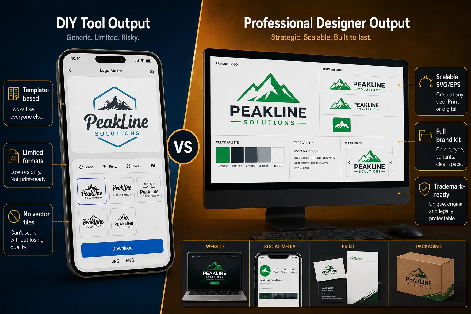
DIY logo tools, AI generators and drag-and-drop builders, can be useful for exploring visual directions quickly. They are not always suitable as the final answer for a serious business identity, because template overlap, export limits, unclear ownership, and weak logo-system support can create problems later.
The core limitations of DIY tools:
- Template-based outputs mean many businesses end up with similar-looking logos.
- Low-cost tools often restrict access to the most useful professional files, especially scalable vector formats.
- Customisation is limited, adjusting spacing, modifying icon shapes, or creating truly unique marks is not possible in most tools.
- AI-generated logos may have licensing ambiguities that create complications if the business later tries to trademark the mark.
Hiring a professional addresses all of these limitations. A specialist produces a unique mark built specifically for the business, delivers full vector files, and transfers intellectual property rights clearly.
The practical recommendation: use a DIY tool to explore ideas and test directions cheaply. Use a professional designer to produce the final logo that will represent the business in the real world, especially if the business plans to grow, print at large scale, or invest in brand marketing.
Common Logo Design Mistakes to Avoid
Using too many fonts. One typeface, or two at most, is the professional standard. Multiple fonts create visual noise and undermine the mark’s coherence.
Choosing colours without strategy. Picking favourite colours rather than colours that communicate the right brand signals is one of the most common errors. Colour should be chosen for its audience associations, not personal preference.
Designing only for digital. A logo that looks great on screen but cannot be embroidered, screen-printed, or cut from vinyl has limited real-world utility.
Skipping the black-and-white test. If a logo does not work in black and white, it relies too heavily on colour to function. Fax machines, photocopies, newspaper ads, and embossing all require a strong monochrome version.
Using raster files for print. Sending a JPEG to a sign maker or printer will result in pixelated, low-quality output. Vector files are non-negotiable for professional print applications.
Following trends too closely. A logo designed to look current in 2026 may feel dated by 2030. Trends can inform a logo’s aesthetic, but the mark itself should be built to last.
Skipping the brief. Jumping straight to design without a clear brief almost always results in concepts that miss the mark, wasted revision rounds, and a final logo that does not serve the business.
Logo Refresh, Redesign or New Logo?
Many established small businesses reach a point where the existing logo is no longer serving the brand. The decision of whether to refresh, redesign, or start from scratch is not always obvious.
- A logo refresh makes subtle updates, adjusting proportions, modernising the typeface, refining colours, while preserving the core mark. It is appropriate when the logo is recognised but feels dated.
- A logo redesign creates a new mark that may retain some elements of the original (colour, general style) but significantly changes the design. It is appropriate when the business has evolved, repositioned, or outgrown its original identity.
- A new logo starts from scratch with no obligation to the previous mark. It is appropriate for rebranding, pivots, mergers, or businesses whose original logo was never professionally designed.
For a full diagnostic guide to making this decision, including questions to ask, warning signs to watch for, and a step-by-step framework, see the logo redesign vs new logo guide.
How Logo Design Connects to Your Website and Marketing
A logo does not exist in isolation. It is the anchor point for every piece of marketing the business produces.
Website integration. The logo appears in the website header, the browser tab (as a favicon), and often in the footer. It needs to be supplied in the correct formats for each application, typically SVG or high-resolution PNG for the header, and a small ICO or PNG for the favicon. A mismatched or low-quality logo on a website immediately undermines the professionalism of the entire site.
Social media. Profile pictures on most platforms are displayed as circles or squares at small sizes. The icon-only variant of the logo is essential here. A full wordmark that is legible at 400 pixels wide becomes unreadable at 40 pixels.
Print and signage. Business cards, flyers, banners, and vehicle wraps all require vector files. A designer who delivers only PNG files is leaving the business unable to use its logo professionally in print.
Email marketing. The logo appears in email headers and signatures. A correctly sized, correctly formatted logo file makes email communications look consistent and professional.
Video and presentations. The logo appears in video intros, slide decks, and presentation templates. Having the correct file, typically a PNG with a transparent background, makes it easy to place the logo over any background colour.
Consistent logo use across all of these touchpoints is what builds the recognition that makes marketing more effective over time. For a broader view of how to measure and improve marketing effectiveness, the small business marketing ROI guide covers benchmarks and strategies for 2026.
If the business is also investing in video content, the small business video strategy guide explains how to integrate brand assets, including the logo, into video production for maximum impact.
Logo Design FAQ
How long does logo design for small business typically take? A professional logo project typically takes two to four weeks from brief to final delivery, depending on the designer’s workload, the number of concepts presented, and how many revision rounds are needed. Rush timelines are possible but usually cost more.
Do small businesses need to trademark their logo? Trademarking a logo provides legal protection against competitors using a similar mark. It is not mandatory, but it is strongly advisable for any business that plans to grow, franchise, or operate in competitive markets. A trademark attorney should be consulted before filing, the logo must be sufficiently distinctive to qualify.
What file should a small business send to a printer? Always send an EPS or PDF vector file to a printer. These formats are resolution-independent and will reproduce cleanly at any size. If a vector file is not available, a high-resolution PNG (at least 300 DPI at the intended print size) is the next best option. Never send a JPEG for professional print work.
Can a small business use an AI-generated logo professionally? Some AI tools produce logos that are usable in professional contexts, particularly those that deliver SVG files and clear licensing terms. However, expert testing shows that only a small subset of AI generators consistently produce results ready for real-world use without redesign. Businesses planning to trademark their logo should seek legal advice on AI-generated artwork before filing.
What is the difference between a logo and a brand identity? A logo is a single mark. A brand identity is the complete visual system, logo, colour palette, typography, iconography, and usage guidelines, that governs how the brand looks across every touchpoint. Most small businesses benefit from at least a basic brand identity, not just a logo file.
How many logo variations does a small business actually need? At minimum: a primary logo, a horizontal variant, a stacked variant, an icon-only mark, and versions in full colour, black, and white. That is typically six to eight files. A professional designer should deliver all of these as part of a standard logo package.
Conclusion
Logo design for small business is a practical investment in the long-term visibility and credibility of the brand. A professionally designed logo, delivered as a complete system with all variants, colour versions, and file formats, does more than look good. It works reliably across every context the business operates in, from a website header to a vehicle wrap to a social media profile picture.
The path to a strong logo starts with a clear brief. Understanding the business’s personality, target customer, and competitive landscape before any design work begins is the single most effective way to improve the outcome. From there, the decision between a DIY tool and a professional designer depends on the business’s stage, budget, and how much is riding on the brand.
Practical next steps:
- Write a one-page brand brief using the checklist in this guide before approaching any designer or tool.
- Use the Logo Package Readiness Checklist above to confirm what deliverables to request.
- Review the logo design file formats guide to understand exactly which files to ask for and why.
- If the business already has a logo, use the logo redesign vs new logo guide to decide whether a refresh, redesign, or new mark is the right move.
- When ready to hire, review the guide to hiring a freelance graphic designer for a structured approach to finding and briefing the right specialist.
A logo built on a clear brief, delivered with the right files, and applied consistently across every marketing touchpoint is one of the highest-return investments a small business can make.