
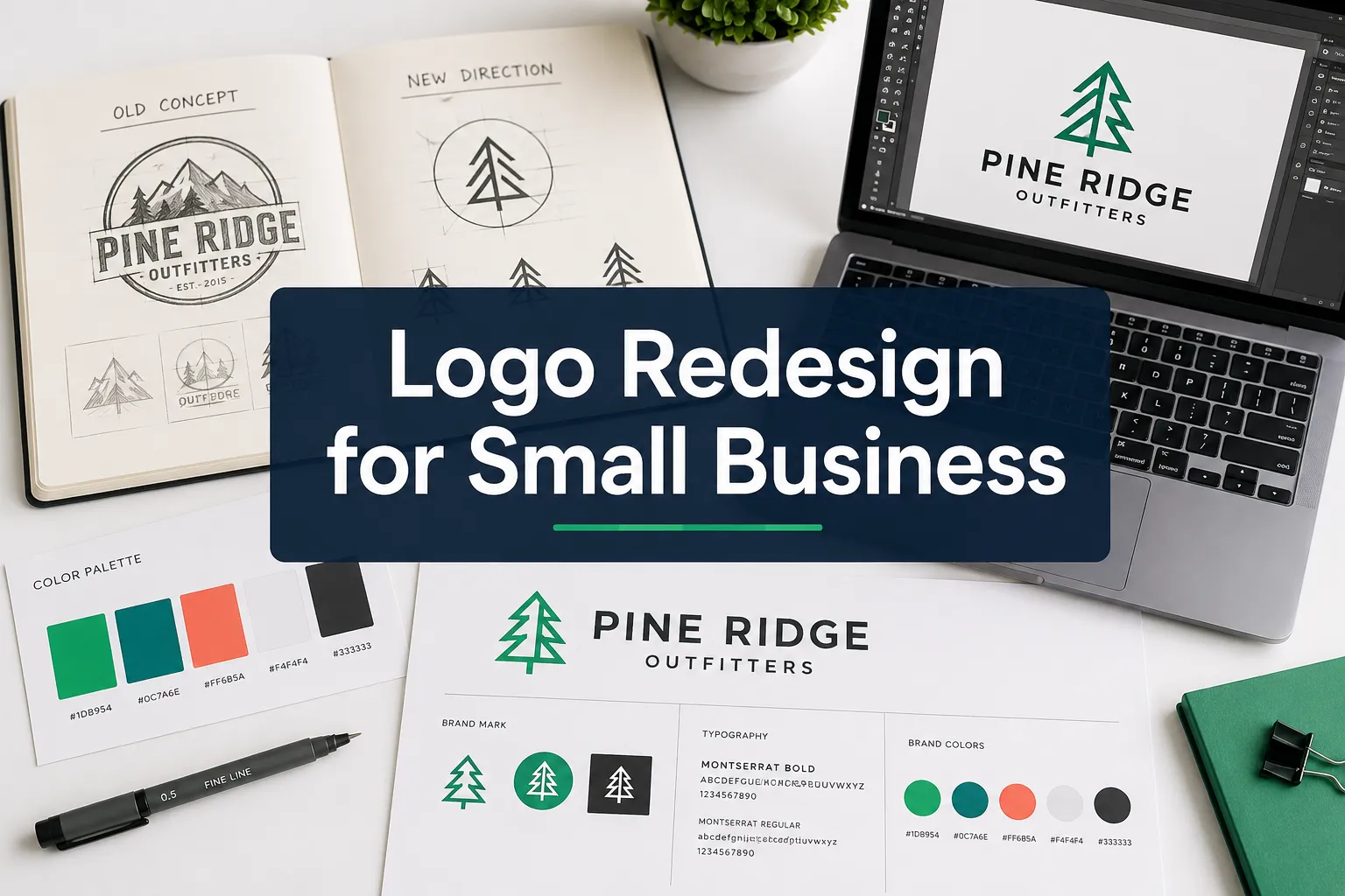
A logo that worked perfectly when a business launched can quietly become a liability years later, not because it looks bad in isolation, but because it no longer matches how the business presents itself everywhere else. Logo redesign for small business is one of the most searched brand decisions owners face, yet most guides skip the hardest part: knowing whether you actually need a change at all. This article gives you a clear, practical framework for making that call, without wasting money on unnecessary changes or holding onto a mark that is actively hurting your credibility.
Quick Answer: A logo refresh updates specific elements, color, weight, spacing, while keeping the core mark recognizable. A full logo redesign replaces the concept entirely. Keeping the existing logo is the right call when it is already doing its job well and is applied consistently. The sections below help you figure out which situation applies to your business.
Key Takeaways
- Most small businesses need a refresh, not a full redesign, the difference matters for budget, timeline, and brand equity.
- A logo that cannot scale to a small avatar, favicon, or social profile thumbnail is actively costing you recognition.
- Inconsistent logo use across touchpoints causes more brand damage than an imperfect logo design.
- Before briefing a designer, audit your existing files, touchpoints, and the business changes that prompted the question.
- Trends in 2026 favor adaptive logo systems with multiple variants, primary mark, compact version, and icon, rather than a single static file.
Table of Contents
- Why Small Businesses Outgrow Their Logos
- Logo Refresh vs Logo Redesign: What Is the Difference?
- Signs Your Logo Needs a Refresh, Not a Full Redesign
- Signs Your Business Needs a Completely New Logo
- When You Should Keep Your Existing Logo
- How Logo Problems Affect Trust, Readability, and Conversions
- What to Audit Before Changing Your Logo
- How to Prepare for a Logo Redesign Project
- Common Logo Redesign Mistakes Small Businesses Make
- What Files and Brand Assets to Update After Changing a Logo
- FAQ
- References
Why Small Businesses Outgrow Their Logos
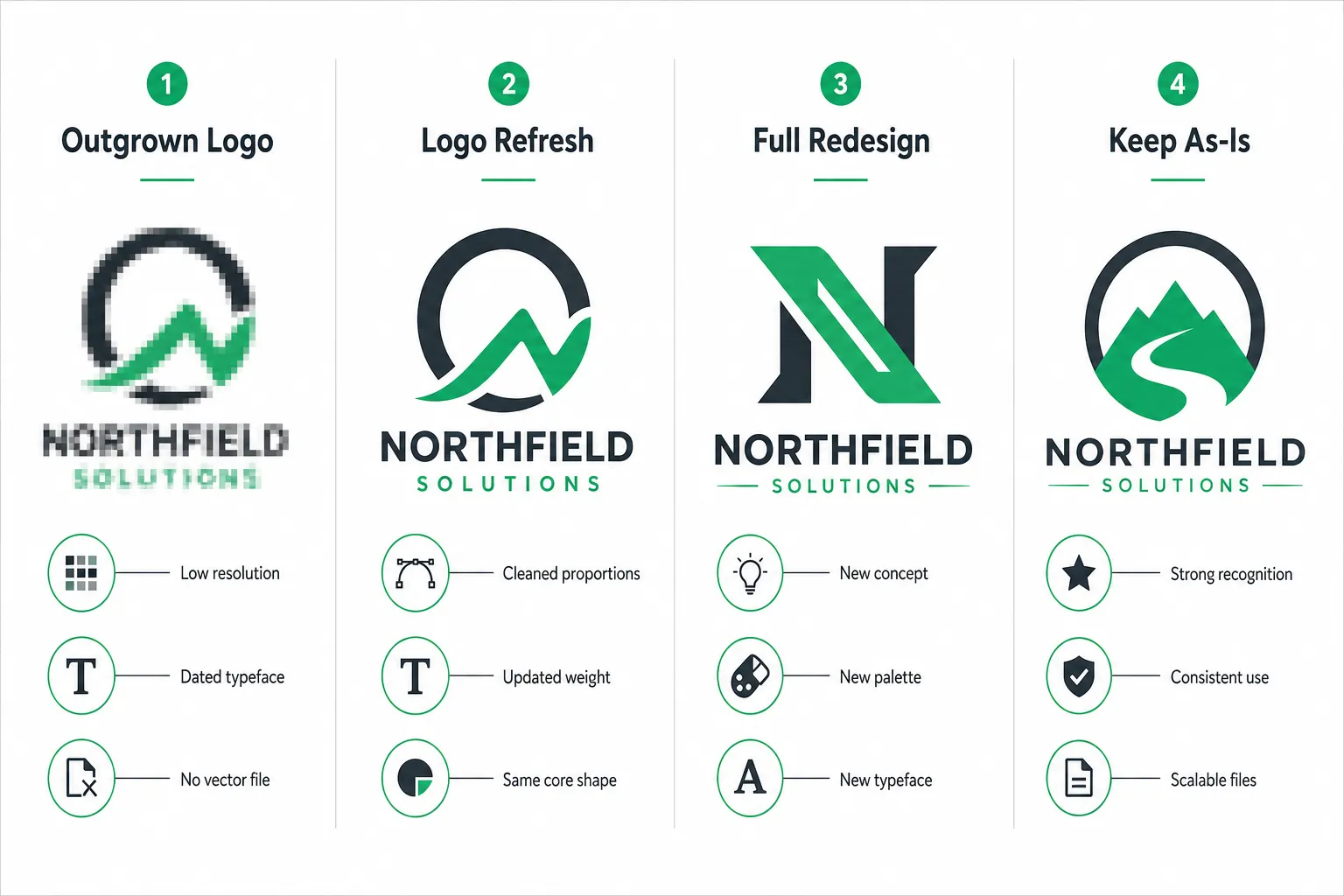
A logo is designed at a specific moment in a business’s life. The typeface, colors, and mark reflect what the founder knew about the business then, the target customer, the price point, the channels where the brand would appear. Businesses change. Logos often do not.
There are four common triggers that cause a small business to outgrow its logo:
1. The business has evolved. A bakery that started selling wholesale to cafes now serves a trade audience that expects a more professional aesthetic. A consultancy that began as a one-person operation has grown to a team of twelve. The logo still signals “startup side project” when the business is anything but.
2. The logo does not survive small spaces. In 2026, a logo must function as a social media avatar, a favicon, an app icon, and a profile thumbnail, often at 32 x 32 pixels. Logos designed before mobile-first thinking became standard frequently fail at these sizes. Trend analysis from Kittl’s 2026 report describes “micro-first simplicity” and logo kits optimized for tiny spaces as a core design priority [1]. If the logo becomes an unreadable blur at small sizes, it is outgrown regardless of how good it looks on a business card.
3. The competitive landscape has shifted. A logo that looked distinctive when the business launched may now blend into a crowded category. New competitors with sharper branding have raised the visual standard in the market.
4. The files are a mess. If the only version of the logo is a low-resolution PNG exported from a presentation tool, the business has already outgrown it, even if the design itself is sound. Proper logo files include vector formats (SVG, EPS, or AI) that scale without quality loss. For a full breakdown of which files matter and why, see the TGR guide to logo design file formats.
Logo Refresh vs Logo Redesign: What Is the Difference?
These two terms are used interchangeably online, but they describe very different scopes of work, with very different costs and risks.
| Logo Refresh | Full Logo Redesign | |
|---|---|---|
| Core concept | Kept | Replaced |
| Typeface | Adjusted or updated | Replaced |
| Colors | Refined or modernized | Replaced |
| Mark/symbol | Cleaned up, redrawn | New concept |
| Brand equity risk | Low | Moderate to high |
| Typical scope | Days to 1-2 weeks | Weeks to months |
| When to use | Logo is recognizable but dated | Logo no longer fits the business |
A refresh is a precision edit. The goal is to make the existing logo look intentional, modern, and technically sound without erasing the recognition that has built up over time. Think of it as the difference between a haircut and a completely new hairstyle.
A full redesign starts from a blank brief. It is appropriate when the existing logo is so misaligned with the current business that no amount of refinement will fix it. This is a higher-stakes project because it means retiring whatever brand recognition the old logo has accumulated.
Keeping the logo is also a legitimate decision, and often the right one. Brand recognition has real commercial value. Changing a logo that is already working introduces risk without reward.
For context on how logo decisions fit into a broader brand strategy, the article on brand identity for small business covers the full picture of visual consistency across touchpoints.
Signs Your Logo Needs a Refresh, Not a Full Redesign
A refresh is the right move when the underlying concept is still strong but the execution has aged. Look for these specific signals:
- The logo is only available as a raster file. If the business cannot provide an SVG or EPS version to a printer or web developer, the logo needs to be redrawn in vector format at minimum, which is a refresh task, not a redesign.
- The typeface looks dated but the mark is solid. Typography trends shift over decades. A wordmark using a typeface popular in 2005 can often be updated with a more current, legible alternative while keeping the same mark and color.
- The colors are close but not quite right. If the palette feels slightly off, too bright, too muted, or inconsistent across print and digital, a color refinement is a refresh task.
- Spacing and proportions feel unbalanced. Early logos are sometimes built without proper attention to kerning, padding, or visual weight. A designer can correct these without touching the concept.
- The logo has too many versions in circulation. If different versions appear on the website, the van, the packaging, and the social profiles, a refresh project should standardize all of them into a consistent system.
2026 trend analysis notes that the most effective small-business logos now ship as a kit: a primary mark, a compact horizontal version, and a standalone icon [1][7]. A refresh is often the right moment to create these variants if they do not already exist.
Signs Your Business Needs a Completely New Logo
A full logo redesign for small business is warranted when the existing mark cannot be salvaged through refinement. These are the clearest indicators:
- The business has fundamentally changed. A pivot to a new market, a merger, a rebrand under a new name, or a dramatic shift in price point all justify starting fresh.
- The logo communicates the wrong thing. If the mark suggests “cheap and cheerful” but the business now serves premium clients, no amount of refinement will fix the mismatch.
- The logo is legally problematic. If a trademark search reveals conflicts, or if the logo was built from stock elements that are not exclusively owned, a redesign is not optional.
- The logo was never professionally designed. A mark built from a free online generator or a template carries recognizable hallmarks that undermine credibility with discerning customers. 2026 trend commentary highlights how AI-generated and template-derived logos are becoming easier to identify, and that brands need visible human authorship and distinctive details to stand out [8][9].
- The logo cannot be adapted for motion. Short animated logo stings are now a baseline expectation for video, Reels, and digital advertising [7]. If the existing logo is so complex or so poorly structured that animation is impractical, a redesign brief should include motion-ready construction from the start.
When You Should Keep Your Existing Logo
This is the answer most logo redesign articles skip: sometimes the right decision is to do nothing.
Keep the existing logo when:
- Recognition is already strong. If customers, suppliers, and staff immediately associate the mark with the business, that recognition has commercial value. Changing it means starting that accumulation over.
- The logo is applied consistently. If every touchpoint uses the same version, the same colors, and the same proportions, the logo is doing its job even if it is not the most exciting design in the category.
- The files are in good shape. If the business holds vector source files and a clear set of usage guidelines, the logo infrastructure is sound.
- The motivation is boredom, not a business problem. Owners see their logo every day. Customers see it far less often. Changing a logo because the owner is tired of it, rather than because it is causing a measurable problem, is a common and expensive mistake.
A logo that customers recognize and trust is worth more than a logo that wins a design award but confuses the audience it is supposed to serve.
How Logo Problems Affect Trust, Readability, and Conversions
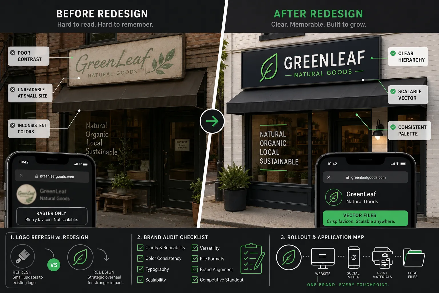
A weak logo does not announce itself. It works quietly against the business in ways that are easy to attribute to other causes.
Trust signals. Research consistently links visual quality to perceived credibility. A pixelated or visually inconsistent logo on a website or proposal document signals to a prospective customer that the business may not pay attention to detail in its core work either. This is especially damaging for service businesses where trust is the primary product.
Readability at scale. A logo that is illegible at small sizes is invisible in the places where discovery happens: Google Maps listings, social media thumbnails, mobile search results. 2026 design analysis emphasizes that logos must survive at favicon and avatar scale, not just at full size on a website header [1][7].
Brand consistency and conversion. When a logo appears in five different versions across a website, a social profile, a printed flyer, and an email signature, it creates a subtle sense of disorder that erodes confidence. Consistent visual identity across every customer touchpoint supports the kind of familiarity that drives repeat business and referrals.
For businesses investing in content and video marketing, a consistent logo also matters for brand recall in short-form content. The article on small business video strategy covers how brand assets perform in video and social formats.
Logo problems also affect marketing efficiency. When a business cannot supply a clean, high-resolution logo to a media partner, a trade publication, or a co-marketing campaign, it either misses the opportunity or appears at a disadvantage. That has a direct impact on small business marketing ROI.
What to Audit Before Changing Your Logo
Before spending money on any logo work, conduct a structured audit. This takes less than an hour and produces a clear brief.
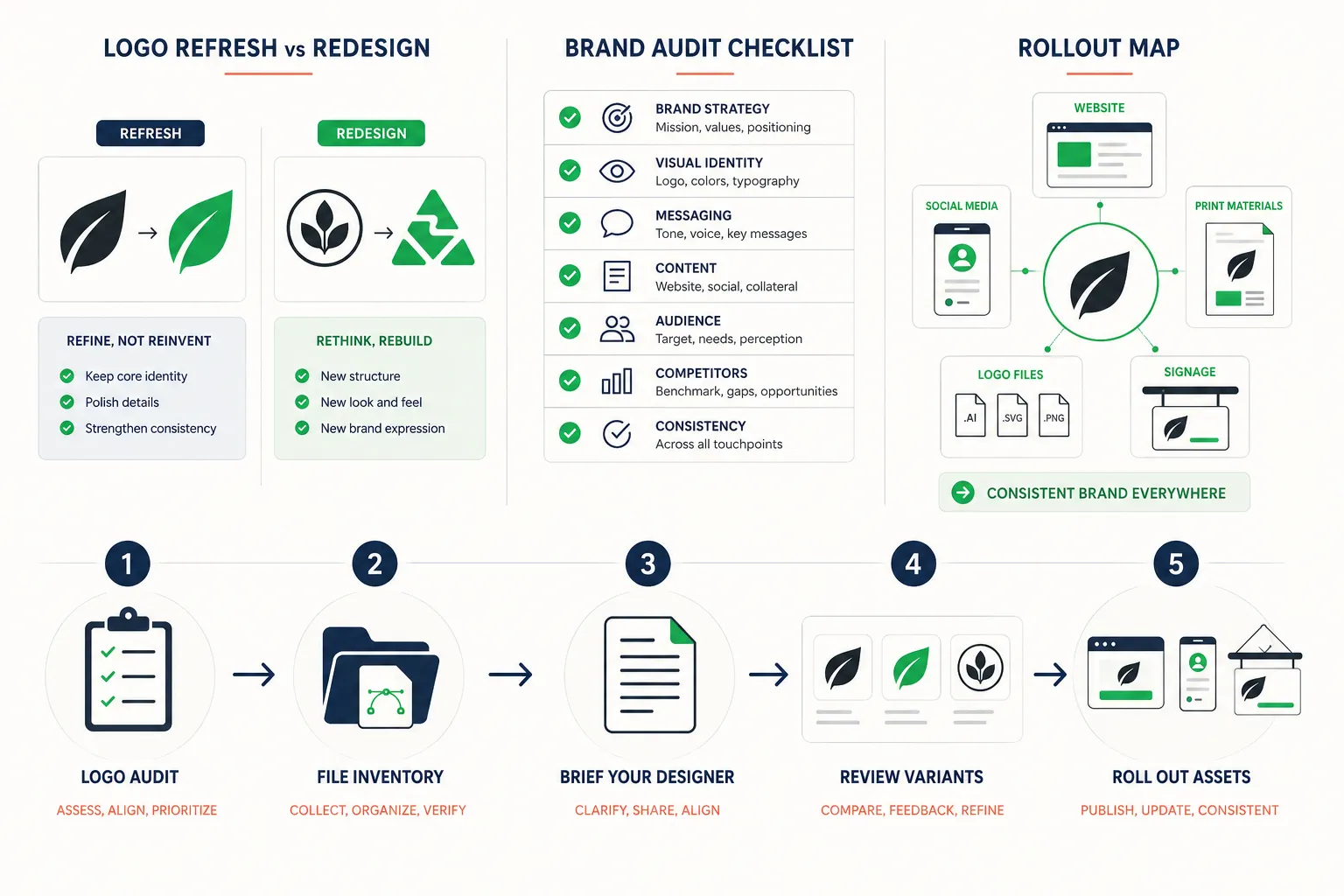
Step 1: Collect every version of the logo in use. Pull the logo from the website, social profiles, email signature, printed materials, signage, packaging, and any co-branded assets. Count how many different versions exist.
Step 2: Check the file formats. Do vector source files (SVG, EPS, or AI) exist? Is there a version with a transparent background? Is there a dark-background version? Missing formats are a refresh task regardless of the design quality.
Step 3: Assess performance at small sizes. Resize the logo to 40 x 40 pixels. Is it still readable? Does the mark hold up, or does it become a smear?
Step 4: List the business changes since the logo was created. New services, new markets, new price points, new audiences, new channels. The longer and more significant this list, the stronger the case for a redesign rather than a refresh.
Step 5: Ask three trusted customers what the logo communicates. Their answers will often be more revealing than any internal discussion.
How to Prepare for a Logo Redesign Project
Preparation determines the quality of the outcome more than any other factor. A well-prepared brief produces better work in less time.
Define the business problem, not the design solution. The brief should explain what the logo needs to achieve, communicate premium quality, appeal to a trade audience, work across physical and digital channels, not specify what it should look like. Designers solve visual problems better when they understand the underlying business context.
Gather reference examples. Collect logos from outside the immediate category that communicate the feeling the business is aiming for. Noting what to avoid is equally useful.
Specify the required deliverables. In 2026, a complete logo package for a small business should include: a primary mark, a compact/horizontal version, a standalone icon or monogram, color and monochrome versions, and dark-background variants. It should be delivered in vector formats (SVG, EPS, AI) and optimized raster formats (PNG with transparency). Requesting animated variants for video and social use is increasingly standard [7].
Set a realistic timeline. A logo refresh can be completed in days. A full redesign with multiple concepts, revisions, and a complete asset package typically takes several weeks.
Plan the rollout. A new logo is not finished when the files are delivered. It needs to be applied consistently across every touchpoint, which takes planning, not just execution.
For businesses that regularly need design work beyond a single project, the guide to outsourcing graphic design covers how to build an efficient ongoing relationship with a designer.
Common Logo Redesign Mistakes Small Businesses Make
These are the errors that most reliably produce disappointing outcomes.
Designing by committee. Involving too many stakeholders in logo feedback produces a mark that offends no one and excites no one. Limit final approval to one or two decision-makers with a clear understanding of the business strategy.
Prioritizing personal taste over audience perception. The owner’s favorite color is not a brand strategy. The question is always: what does this communicate to the intended customer?
Skipping the file brief. Accepting a logo delivery without specifying the required formats means the business will be back to a designer within months asking for a version that works on a dark background, or at small size, or for print. Specify all required formats upfront.
Changing the logo without updating all touchpoints. A new logo that appears on the website but not on the email signature, the invoice template, or the social profiles creates the exact inconsistency that was supposed to be fixed.
Treating the logo as the entire brand. A logo is one element of a brand identity system. Without consistent typography, color use, and tone of voice across all communications, even the best logo will not produce the brand recognition the business is hoping for. The article on brand identity for small business explains how these elements work together.
What Files and Brand Assets to Update After Changing a Logo
A logo change is a project, not a single deliverable. This checklist covers the most commonly missed touchpoints.
Digital assets:
- Website header, footer, and favicon
- Social media profile images and cover photos (all platforms)
- Email signature (all team members)
- Email newsletter template header
- Google Business Profile
- Online directory listings
Document templates:
- Proposals and quotes
- Invoices and receipts
- Letterhead and presentation templates
- Email auto-responders
Physical and printed materials:
- Business cards
- Signage and vehicle graphics
- Packaging and labels
- Uniforms and branded merchandise
Marketing assets:
- Paid advertising creative
- Video intros and outros
- Social media post templates
- Any co-branded materials with partners
Keeping a master brand asset folder, with all approved logo variants, color codes, and font files, makes every future update faster and ensures consistency. For businesses using automation tools to manage brand assets at scale, the guide to small business AI automation covers relevant workflow options.
FAQ
How much does a logo redesign for small business typically cost? Cost varies significantly based on scope and the designer’s experience. A logo refresh, redrawing and modernizing an existing mark, is generally less expensive than a full redesign that starts from a new concept. The most important cost factor is clarity of brief: a well-prepared brief reduces revision rounds and total hours.
How long does a logo redesign project take? A refresh can be completed in a few days to two weeks. A full redesign with concept development, revisions, and a complete asset package typically takes three to six weeks. Rushing the process tends to produce weaker outcomes.
Will changing my logo confuse my existing customers? A well-managed logo change with consistent rollout across all touchpoints rarely causes lasting confusion. A refresh, which retains the core mark, carries the lowest risk. A full redesign requires a brief transition period, but customers adapt quickly when the new mark is applied consistently everywhere.
What logo files should I receive at the end of a redesign project? At minimum: SVG, EPS or AI (vector source), PNG with transparent background (multiple sizes), and a dark-background variant. In 2026, a complete package should also include a compact version, a standalone icon, and ideally a simple animated version for video use [1][7].
Can I update my logo without changing my brand name or colors? Yes. Many successful logo refreshes update only the typeface, proportions, or file quality while keeping the name and color palette identical. This approach preserves recognition while solving technical and aesthetic problems.
How do I know if my logo is hurting my business? The clearest signals are: the logo is unavailable in vector format, it becomes unreadable at small sizes, it appears in multiple inconsistent versions across touchpoints, or it communicates a positioning that no longer matches the business. If none of these apply and customers recognize it, the logo is likely doing its job.
Conclusion
The decision to pursue a logo redesign for small business should be driven by a specific, identifiable business problem, not by aesthetic boredom or trend-chasing. Most small businesses that feel their logo is “due for a change” actually need a targeted refresh: cleaner files, better small-size performance, and consistent application across every touchpoint.
A full redesign is the right investment when the business has fundamentally changed, when the logo communicates the wrong positioning, or when the existing mark was never built to a professional standard. Keeping the logo is the right call when it is already working, when customers recognize it, files are in order, and it is applied consistently.
Actionable next steps:
- Run the logo audit in this article before briefing any designer. Collect every version in use, check the file formats, and test readability at small sizes.
- Use the decision tool above to identify whether a refresh, redesign, or no change is warranted.
- If a change is needed, prepare a written brief that defines the business problem, the required deliverables, and the rollout plan before any design work begins.
- After any logo change, update every touchpoint systematically, digital, document, physical, and marketing assets, using the checklist above.
- Store all approved logo variants, color codes, and font files in a single, accessible master brand folder that every team member and supplier can access.
A logo that is technically sound, consistently applied, and accurately represents the current business will always outperform a more beautiful mark that exists only as a low-resolution PNG in one inconsistent version.
References
[1] 2026 Logo Trend Report – https://www.logolounge.com/trend/2026-logo-trend-report
[2] Logo Design Trends 2026 – https://digitalsynopsis.com/design/logo-design-trends-2026/
[3] Logo Design Trends – https://www.vistaprint.com/hub/logo-design-trends
[4] Logo Design Trends – https://www.wix.com/blog/logo-design-trends
[5] These Logo Design Trends Will Define 2026 – https://www.creativebloq.com/design/logos-icons/these-logo-design-trends-will-define-2026
[6] Logo Trends – https://www.shopify.com/blog/logo-trends
[7] Logo Branding Design Trends 2026 – https://malbardesign.com/logo-branding-design-trends-2026/
[8] Top Branding Design Trends 2026 – https://www.thebrandingjournal.com/2026/01/top-branding-design-trends-2026/
[9] Logo Trends – https://www.uxstudioteam.com/ux-blog/logo-trends
[10] Logo Design 10 Visual Trends To Watch In 2026 – https://www.freelogodesign.org/blog/2026/02/03/logo-design-10-visual-trends-to-watch-in-2026